About Standard Elements of the User Interface
Explains the concept of standard elements of the user interface.
In the course of using the software, you will be confronted with the same buttons and functional principles again and again. Their general function is explained here:
Buttons of the user interface
The following table gives an overview of the buttons types found in the user interface.
| Button | Function |
|---|---|
 | A button with three dots behind the text opens a dialog or another program like LINEAR Building. |
 | A button with three dots opens a dialog. |
 | The arrow at the right edge of a button opens or closes the corresponding section. If the CB has the mouse focus, press F12 to open or close all sections simultaneously. |
 | A button with an opening square bracket behind the text performs an action in the drawing area. Entries that may be required from the user will be communicated with displayed notes. Usually, you can select the components you want to use before performing the action. |
 | A button with an opening square bracket performs an action in the drawing area. |
 | Activates the context-sensitive help after clicking recognizable by the question mark next to the cursor. Clicking a UI element opens the corresponding help. F1 also opens the context-sensitive LINEAR help. |
Check boxes
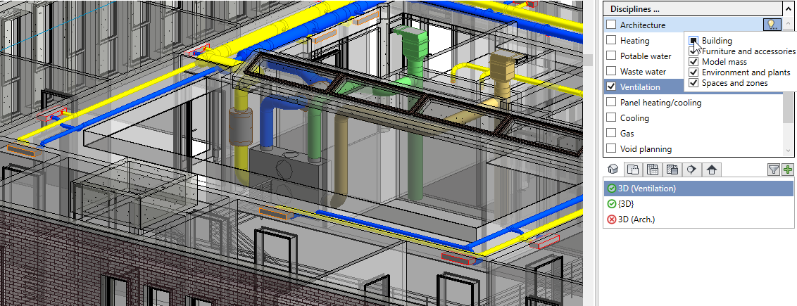
In the Project tab: In the Disciplines section, the check boxes of the context menu can have three states: activated, semi-activated and deactivated. The check boxes of the context menu control the visibility of components and pipes or ducts of the corresponding discipline. Semi-activated check boxes represent the respective category semi-transparently.
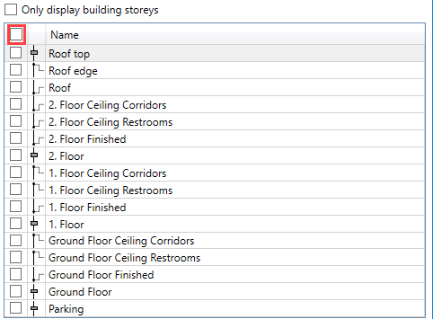
In tables such as in the Import/Synchronize dialog: A check box in the header allows quick selection or deselection of all entries of the table.