LINEAR Brand Guidelines
In order to establish a consistent brand visualization in all areas of corporate communication, we have developed general brand guidelines that define the use of logo, colors and typography. Based on these basic rules, all communication activities can be realized in order to establish and maintain LINEAR's brand image.
If you are interested in using the LINEAR logo or design elements, we will be happy to provide you with the necessary files after consultation. To do so, please contact us at marketing@~@linear.eu.
The application of the points listed below is obligatory for every user. Exceptional situations must be clarified with the head of marketing at LINEAR. Changes made by the user himself will not be accepted.
Visually, LINEAR is represented by a strong brand and a distinctive corporate design. The aim is to authentically convey LINEAR's central values, such as modernity, innovative strength, dynamic energy as well as quality, both internally and externally. A uniform and consistent appearance is particularly important here. It ensures recognition, increases awareness and thus helps to establish a professional profile for LINEAR.
Company name
In continuous texts, the name LINEAR is not displayed as the company logo, but in the respective typeface exclusively in capitals. Compound terms in connection with LINEAR are not linked through: e.g. LINEAR Desktop, LINEAR Software.

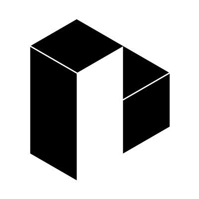
Logo
The LINEAR logo consists of a figurative mark, a word mark and our claim. The figurative mark not only visualizes the initial letter "L" of the company name in its basic form and in the resulting white space, but also shows our connection to the construction industry through the association of a 3D building shape.
The black version of the LINEAR logo is used in media whose halftone quality is insufficient, when there are technical limitations (embossing, die-cutting) or when the colored logo is generally not optimal in an application. If the logo is to be displayed negatively, only the white version may be used. The logo is not to be colored in other colors.
From a size of < 250 px or < 8.8 cm, the logo is used without a claim to guarantee sufficiently good readability.
For appropriate purposes, the figurative mark can be used alone and in the following variations.

Typography
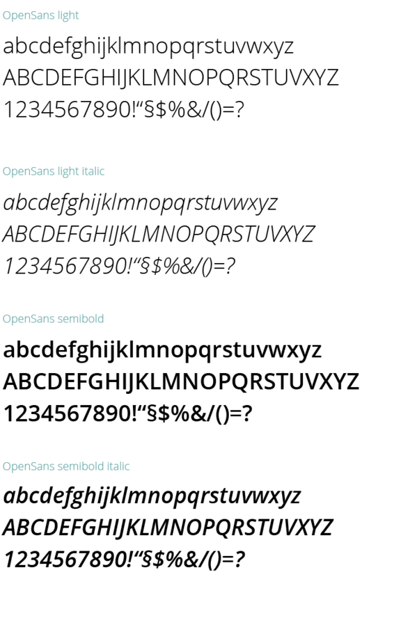
LINEAR's house and base font is the OpenSans typeface family. OpenSans is a sans serif Antiqua typeface, which is characterized primarily by its excellent legibility and narrow tracking. Only the four OpenSans typefaces listed below are used in our communications.
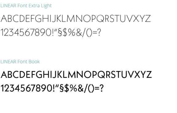
The headline font is the LINEAR Logo Font. This is a typeface specifically edited for LINEAR to match the typeface of the wordmark. In addition to the standard OpenSans font, it is used to emphasize selected parts of the text. This font can be used in large areas of application – solely in capitals in accordance with the word mark. The LINEAR logo font should be selected and used only in large headlines and in the two following styles, so that it can develop its typeface character well.
LINEAR colours

RGB 24|61|70
CMYK 89|56|51|52
#183d46

RGB 97|164|164
CMYK 64|18|36|2
#61a4a4

RGB 196|218|212
CMYK 28|6|19|0
#c4dad4

RGB 236|242|240
CMYK 9|2|7|0
#ecf2f0
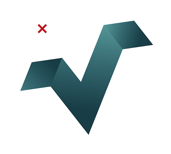
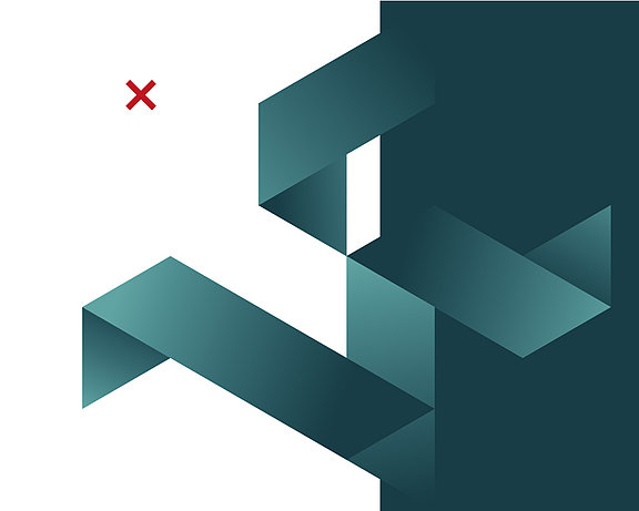
Design element
The LINEAR "Folded Cube Pattern" is a design element of the LINEAR corporate design that is based on the figurative mark and can be included in the overall creation in different variations. The alignment of the elements must always correspond to the 30° angle from the LINEAR logo in order to achieve a uniform visual language. If the element as a whole is to stand out from a colored area (in LINEAR turquoise), it should be positioned along the edges or at the corner points of the Cube Pattern.