-
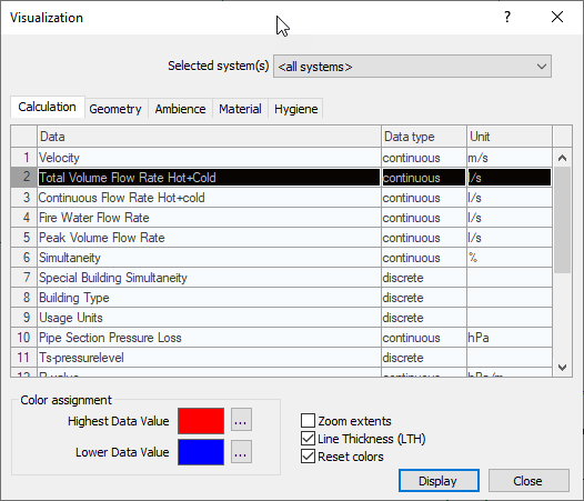
Select the row in the table containing the data that you want to highlight in color in the drawing.
-
In the Color Mapping section, click the … buttons to adjust the colors for the upper and lower data values.
-
If necessary, change the rendering settings using the checkboxes Zoom Extents, Line Weight (LW), and Reset Colors.
-
Click Display.
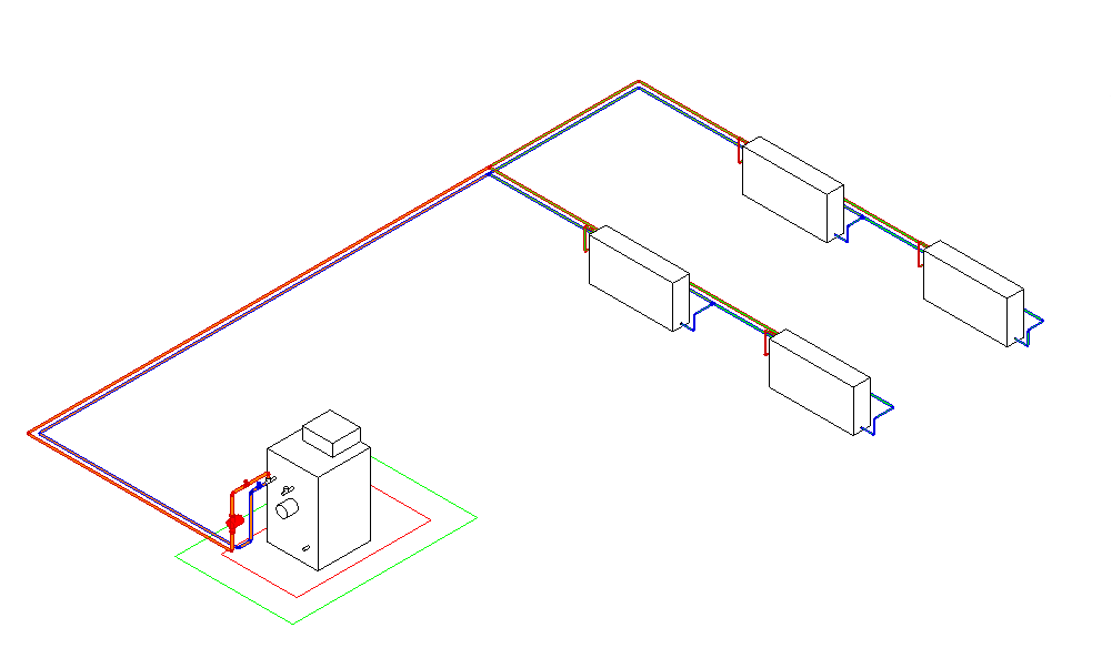
The dialog closes and the selected data is highlighted in color in the model.
-
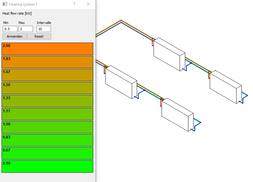
Using the dialog with further options for the visualization that then appears, you can further filter the view using the Min, Max and Intervals fields and by selecting individual intervals in the color scale.